9 typical corporate design mistakes and how to avoid them
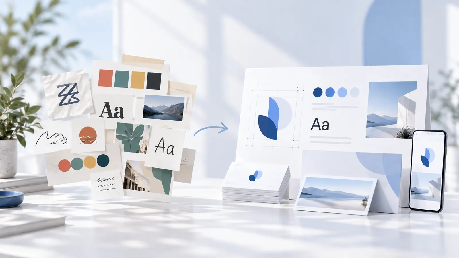
A logo can be successful and the overall brand presence can still look inconsistent. This often is not caused by a single poor design, but by many small decisions that do not fit together.
These nine mistakes occur especially often when designs are created without shared rules.
1. Using too many colours
If every graphic gets a new colour, a recognisable line is missing. Define a small palette with clear roles and use new colours only when there is a good reason.
2. Constantly changing fonts
One font on the website, another on the invoice and three more on social media: that rarely looks like one brand. Define a few fonts and fixed use cases.
3. Changing the logo again and again
Sometimes the logo is stretched, rotated or recoloured so that it “fits”. That weakens recognition. Prepared variants for different formats and backgrounds are better.
4. Putting readability second
Light grey text on white may look subtle, but is often hard to read. Check contrast, font sizes and spacing – including on mobile.
5. Designing only for one channel
A design that works on a large presentation slide does not automatically read well as a small profile picture. Test logos and templates at the sizes they will really be used.
6. Adopting trends without a brand connection
Not every popular colour or font suits your business. For every style decision, ask whether it supports the intended effect or is only fashionable right now.
7. Not defining binding files
If several versions of logo and colours circulate in a team, mistakes are almost inevitable. Store valid assets centrally and name them clearly.
8. Creating templates without a system
Templates only save time if they rest on the same design rules. Otherwise you end up with a collection of individual drafts that have little to do with each other.
9. Never checking the brand presence
A company evolves. New offers, channels and target groups change the requirements. So check now and then whether the design rules still fit, without redesigning everything for every small detail.
A simple quality check
Place your website, social media profile, latest post graphic and a business document side by side. Do logo, colours, fonts and image style match? Is the sender recognisable even without their name? If not, clarify the basic rules first.
Conclusion
Most corporate design mistakes arise not from a lack of creativity but from a lack of consistency. A small, well-maintained brand kit and reusable templates can prevent much of this. In Grafikbuddy logo, colours and fonts live in one place, and with the brand check you can compare your website, designs or texts against your brand guidelines.
Frequently asked questions
Must corporate design always look the same?
+
No. Different formats may vary, as long as recognisable basic rules remain.
What is the most important mistake?
+
Often it is the lack of a binding system for colours, fonts and logo variants.
Should I redo everything right away if I find mistakes?
+
Not necessarily. Start with the inconsistencies that are most visible or occur most often.